Full Art Alteration Gallery
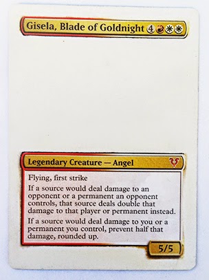
In this tutorial I'm going to create this borderless alteration of Gisela, Blade of Goldnight.

Understanding proxies is the first step for doing this alteration. Please review How to Make Proxies.
Materials:
* Inkjet printer. I use an HP Envy 120.
* Photoshop or GIMP.
* Fan paint brush. Don’t buy a foam brush they tend to flake and ruin the application.
* Acetone. Nail polish remover is often cheaper than pure acetone, but be sure to look at the ingredients and buy the kind with mostly acetone.
* Any Glossy InkAid or Golden Digital Ground Clear. Make sure you don't buy any Matte InkAids, only Glossy versions work. *Update* The digital ground appears to be discontinued so use the InkAid, its the same stuff.
* FolkArt Glass & Tile Medium.
* Krylon Matte Finish. Do not buy Rustoleum brand finish it is far to thick.
* Removable Double sided tape.
* Acetone resistant tape. Scotch brand tape will not work because the acetone will eat right through it. I buy Everyday Essentials brand at Albertson’s. Any tape that does not disintegrate when rubbed with acetone will work. Sometimes packing tape can work.

1) Blanking
For a proxy we would blank the entire card. However, since this is an alter we want to blank just the parts of the card we want to replace and leave any part of the original card we want to keep.
For this Gisela alteration I chose to remove all of the borders and paint in any gaps left in the text box with black acrylic paint. The entire card will be printed over, however the areas that are white will show the print the most.
Ok, so how do you selectively remove parts of a card? The answer is to use acetone resistant tape.
Apply the tape over the area you want to preserve and then rub acetone over the area you want to remove. Do this section by section until done.
For curves or small details acetone is not precise enough. In this instance I use an exact-o-knife to gently rub away the area I want to remove.
2) Seal
Spray the surface of the entire card with varnish. Let dry.
3) Prime
Take the FolkArt Glass & Tile Medium apply evenly to the entire card. Let dry.
Take the InkAid apply evenly to the entire card. Let dry.
4) Carrier
Print out a template. Attach the card to the template with double sided tape.
5) Printing
Now this is where things get interesting.
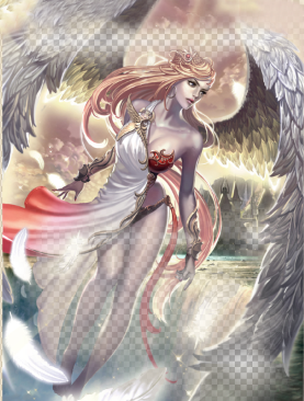
Choose a full art image for your card. For the Gisela I’m going to use this art:
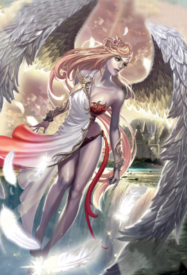
I’m posting a scaled down version of my art. You will want to make sure that your artwork is much higher resolution.
Now we can not just print this image over our blanked card. If we did the text would be obscured. What we need to do is make the image transparent in some areas.
To help me I like to use a life size photo of a real card. To make sure that it is actually life size either compare it to a template that you know is life size or print out your photo and ensure that the print is the exact same size as a real card. It doesn’t matter what card you use in the photo. Here’s the photo I’ll use:

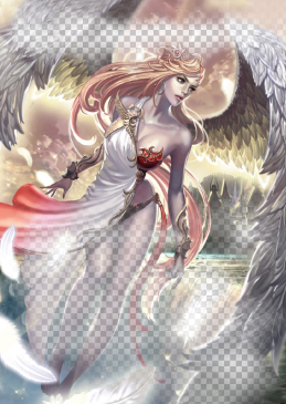
Next I put my artwork layer on top of the layer with the card photo and lower its opacity. This will give me a general idea of how the artwork is going to line up with our actual blanked card. I have the artwork of the photo set to pure white to give me a better idea of how things will look.

Next I want to increase the transparency of the artwork in areas that overlap with the text underneath (I’ll explain how I do this later).
Once I do that I’ll set the opacity of the artwork layer back to 100%. Now it looks like this:
In the picture above the areas that cover any text are low opacity and the areas that do not cover text are 100% opacity. Now if we hide the photo underneath we get this:
If we print this out on top of our blanked card it would appear as though the text boxes and our artwork are blended together much like they were in Photoshop.
Since we are printing over a gold colored text box I like to add one layer of light gold color as a background to make the blending even smoother. It’s hard to see but the image below has a slight golden background.
The image above is the final image I will print.
Ok but how did I make part of the artwork transparent?
The answer is I used a layer mask.
Select the artwork layer then click on this icon at the bottom of Photoshop.

This will create a layer mask like this:
Click on the layer mask (the all white rectangle on the right). Once selected it will look like this:
The layer mask allows you to selectively lower/increase opacity of the image by drawing over it with black/white. The darker the color the less the opacity. Drawing black on the layer mask makes the image completely transparent in that area.
We want to make the artwork transparent where we want the original border or text to show through.
To create a blended effect like I’ve done above we want the change in opacity to be gradual. I was able to create this very smooth blending with repeated use of the gradient tool. The default configuration of the gradient tool prevents using it more than once. You must configure it first.
To select the gradient tool click on the paint bucket and hold down for a second. The gradient tool should appear. Now at the top of the screen you should see something that looks like this:
Double click on it to get something that looks like this:
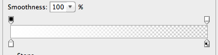
Notice the four little squares. Click on the one on the bottom left. You should now have the option to change its color.

You will want to alternate between black and white on the left and transparent on the right.
Once this is set up and you have the layer mask selected you will be able to use the tool over and over again gradually blending the artwork into the photo underneath by drawing black gradients on the layer mask.
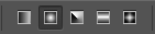
There are different shapes of the tool. I used this one (second one from the left) on Gisela:
Using the gradient tool can be tricky so you may want to look up a proper guide on how to use it. I’m just giving you an overview of how I use it.
One other tricky part of this process is knowing how much transparency to use. The blended picture in Photoshop can be much different from the blending effect of the actual print. You must understand that dark inks obscure more than they appear to in Photoshop and light inks obscure less than they appear to in Photoshop. Notice that in this example the text is barely readable in Photoshop yet in the printed card the text is perfectly readable. This is because the color of the ink is very light. The only way to know how transparent an image will appear on an actual card is to do lots of trial and error and learn from experience.
Now I should mention that there are other ways to get a smooth gradient in Photoshop. I'm not going to go into too much more detail here, but in some prints I used the shape tool to create a black rectangle and then double clicked that layer and played around with the effects to give it an outer glow. Then I placed rectangles like that around the various text boxes to make it look like the image blended into them.
Ok now it’s time to go ahead and print. Please be sure to try this with several test cards to make sure you get the hang of this technique as it is quite tricky at first!
6) Finish
Spray the whole card with Matte Finish to protect the print.
FAQ
Q: The print didn’t come out right for whatever reason. Did I just ruin my card?
A: No you’re fine. Take a household cleaner like 409 and spray it on a paper towel, then rub off the ink and start over. Try not to screw up too many times though or you might cause permanent warping. However, once you seal the card with finish at the end there is no going back.
This comment has been removed by a blog administrator.
ReplyDeleteA quick question... does this method lead to added thickness on the card? Can it be told apart from non-altered cards by feel or weight?
ReplyDeleteMany thanks
i cant tell the difference at all. Its the equivilant of one layer of paint. So if you painted over a card could you tell the difference?
DeleteI cant feel any difference in weight
DeleteGreat info. Where can I obtain some of the original high resolution digital artwork?
ReplyDeleteThis site as some insane high res art http://www.wikiart.org/en/ivan-bilibin/illustration-for-the-russian-fairy-story-the-frog-princess-1899 (make sure you click on "view all sizes" when you see an image
DeleteLegend of the Cryptids has some great modern style art at decent res https://www.google.com/search?q=legend+of+the+cryptids&rlz=1C5CHFA_enUS532US532&source=lnms&tbm=isch&sa=X&ved=0ahUKEwiotLayrpnOAhXLMSYKHT6fBkkQ_AUICCgB&biw=1026&bih=646
This comment has been removed by the author.
ReplyDeleteHP Envy 120 Driver Installation Help
ReplyDeleteExcellent information.I like the way of writing and presenting.
Is inkaid still available to purchase? Has anyone had any success with a similar product that's more Avilable?
ReplyDelete